
The largest air force in the world is the US Air Force.
The second largest is the US Navy.
With US Navy mission planning software 12 years out of date, they turned to us to modernize for a new age…
While unifying mission ops with the US Air Force.
The question was could we…
Design a cohesive and unified mission planning system that is simultaneously flexible enough to accommodate the needs of the Air Force and Navy, and specialized enough to tailor to the needs of each unique planning use case.
The Context
The Air Force and Navy presently have distinct yet extremely similar mission planning softwares. In an effort to align the two, the government tasked us with creating a Unified Planner that both the Air Force and Navy can plan on. The current systems have different navigations, so our first priority focused on getting the navigation correct to accommodate Air Force and Navy users.

-
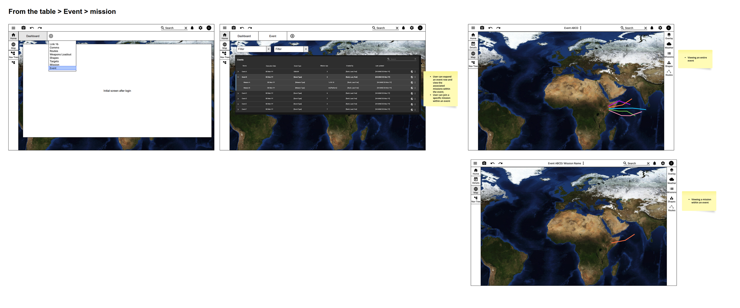
Throughout this case study, the terms Event, Mission, Free Plan, and Plans are used.
Missions are military operations that need to take place at a certain time and place with a desired end goal. These missions can occur independently of each other.
Events are composed of multiple missions that are typically coordinated together to complete one larger goal.
Free plans is an internal term coined to describe the varying data sets within an event or mission. These can include route plans, communications plans, and other plans that might be needed to successfully execute a mission or event. These Free Plans can live outside of an event or mission and later assigned to an existing or new event or mission at a later date.
Plans is a generic term used to refer to events, missions, and free plans as a whole.
Events are composed of multiple missions and these missions typically act together to complete a goal. The Navy operates within the context of events and the Air Force usually plans standalone Missions that do not have to be part of an event.
-
The Tiger Team is composed of 10 individuals from across the enterprise. I was 1 of the 3 lead designers that was leveraged from the larger design team. The rest of the team included the Scrum Master, Lead developers from the infrastructure, solutions, backend, and front-end teams.
-
Air Force and Navy Mission Planners
Much of mission planning (regardless of if you’re in the Air Force or Navy) requires the users to plan while referencing or using a map.
The current system’s navigation is segmented and does not fit into the user’s daily work flow. Oftentimes, planners need to reference the map in order to enter in their data simultaneously. When the user logs in, they are brought to a page with a data table and options to join an existing plan or create a new one. Regardless of their choice, once they make a selection, the user is brought to the plan’s details page with tabs across the top that contain information relevant to that event or mission. If the user wants to see the graphical contents of a plan, they will have to navigate over to the map to continue their planning.
The current systems also do not have enough flexibility. The user must create either an event or mission before they can start planning subsets of that event or mission. In the real world, users might know the details of a route plan well before the details of a specific mission. The way the current systems are set up, you must create an event or mission before you start that route plan.
-
Stakeholder buy-in: We exercised our persuasive muscles to gain buy-in for the solution. There was resistance to the proposed solution due to conflicting stakeholder interests. Our team had to highlight the pain points in the current solutions and explain how our proposed solution would solve the current issues.
Limited time: The Tiger Team only had one quarter to conduct research, create designs, and start initial implementation. Since we only had 3 months to get to a MVP, we did not have the time or resources to conduct exploratory research. However, we did have access to SMEs (Subject Matter Experts) who have served in the Air Force and Navy and have flown, or have experience with relevant aircraft platforms.
The Desired Outcome
Our top priority is to create a navigation that allows the user to move fluidly between and within plans.
My team and I wanted the new navigation to meet the following criteria:
Ease of interacting with their open/active plan.
Ease of creating a new plans.
Ease of accessing their most used plans, recent plans, or all of the plans within their squadron.
The Process
Wireframes
We were tasked with starting wireframes for this project, deviating from our usual UX process. Prior to designing, we consulted with SMEs to gather insights on what worked well and areas for improvement based on feedback from mission planners. However, we became too fixated on adjusting the existing infrastructure to fit the new Unified Planner, losing sight of the benefits of starting fresh. Our attachment to old navigation patterns and uncertainty about the extent of changes needed hindered progress. Eventually, we realized that completely rebuilding would be less labor-intensive than trying to force-fit the current navigation. Through iterations, we discovered that a drawer-style navigation offered the flexibility we needed.
Iteration 1
In my initial iteration, I leveraged the commonality between the existing planning systems: the tab structure. Each tab contained important plan information, like routes.
Version 1 aimed to explore a modified navigation approach that retained the tab structure users were accustomed to. The Homepage/Dashboard concept remained, with tabs dynamically appearing as users added subsets of the plan, allowing them to work on specific details as needed.
Iteration 2-3
The users' typical workflow involves planning individual parts of a larger plan. To accommodate this, I introduced three plan type categories: Events, Missions, and Free Plans. With Free Plans, users have the flexibility to initiate a plan and complete it later. This led me to create the slide out drawer to work alongside the Dashboard with tabs variation. The drawer allows users to create multiple plans within a single session while staying within the main map planning space. This provides a seamless and efficient experience.
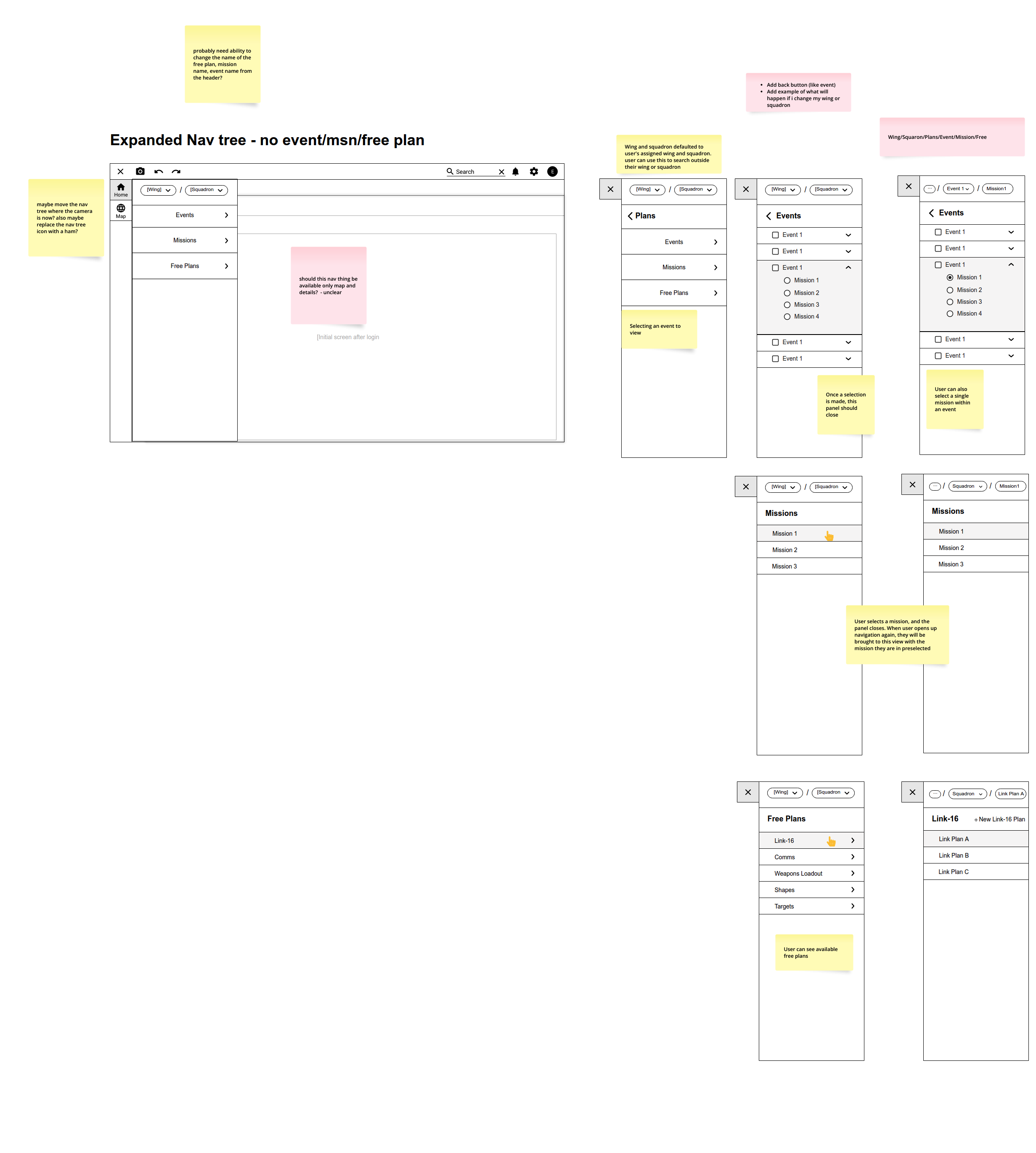
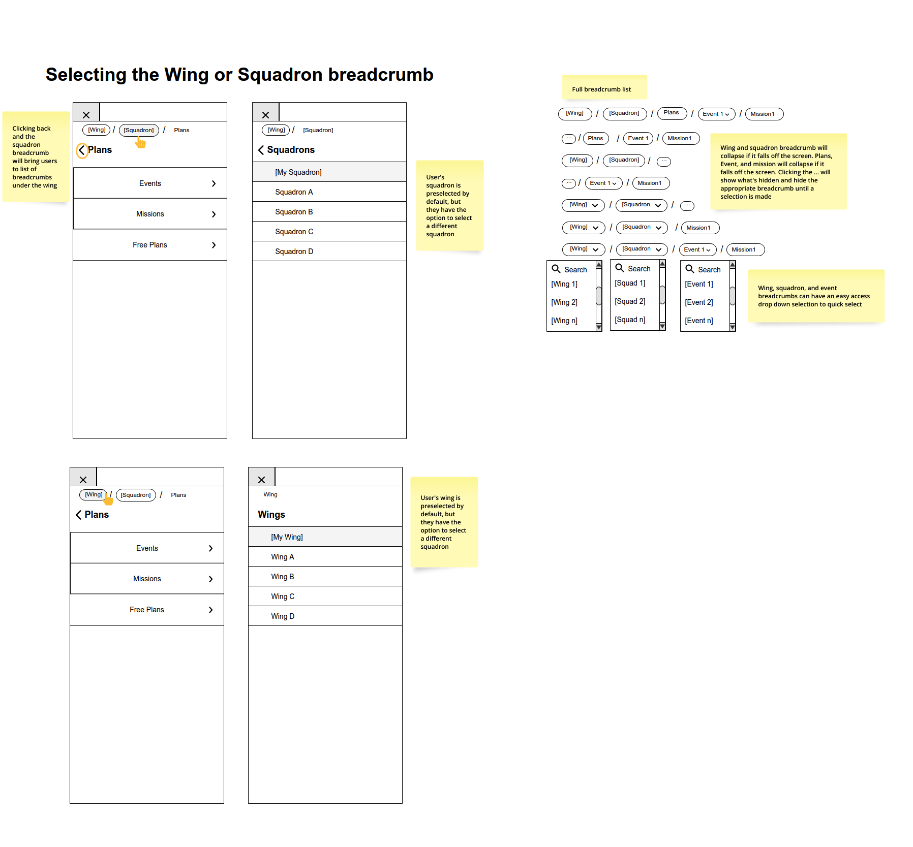
In the third iteration, I incorporated breadcrumbs within the drawer to enable users to navigate effortlessly between different levels, accessing plans within their Squadron, outside their Squadron, and even beyond their Wing. The breadcrumbs not only facilitate smooth navigation but also offer valuable context and system status visibility.
Iteration 4
To address concerns about overwhelming users with excessive options, I categorized plans into "Open" and "All" items within the user’s squadron. This allowed for a more streamlined display, showing only the plans that the user has opened and providing access to all other items within the squadron. In conjunction with the breadcrumbs, this approach enhances navigation and provides a more focused experience.

I received feedback from the SMEs that the “Open” and “All” terminology was too generic, so I explored changing verbiage. I also experimented with a quick filtering toggle within the drawer to display only the opened plans when activated. This exploration revealed the redundancy of having both the slide-out drawer and the Dashboard. As a result, I recognized that a streamlined version of the drawer could function as the primary navigation tool, driving the main content area without requiring users to navigate away from the map to access a subset of a plan.

Final Iteration
In the final iteration, I consolidated all components within the drawer, removing the Dashboard view. This allowed for multi-level nesting as plans often contain nested data sets. In previous iterations, the drawer supported only two levels of nesting. Recognizing the importance of visualizing the plan, I made the map the central focus. Users can now select an item in the drawer, and the map will respond accordingly by zooming in and out on map elements. If a selected item has no visual representation, the main content area transitions away from the map view to display the relevant data.
Collaborating with my colleague, we determined that the Library should house all Squadron plans, rendering the "Open" and "All" tabs and the quick filtering toggle in the drawer unnecessary. Furthermore, the larger team decided that viewing plans outside of the user's Squadron and Wing was beyond the scope for the minimum viable product (MVP), leading to the removal of breadcrumbs.

User Task Flows
Starting wireframes without user flows created scope challenges as there was no clear roadmap to follow. Although not an ideal process, I recognized the value of creating a user task flow based on the wireframes. I explained to the team that documenting the user task flow, even after finalizing the wireframes, would bring benefits. It would serve as a useful tool for stakeholder buy-in when introducing the new navigation. Additionally, it provides a high-level understanding of system connectivity. Surprisingly, creating end-to-end flows after low-fidelity wireframes resulted in higher-fidelity flows that better informed our high-fidelity designs. It also helped validate our low-fidelity designs by evaluating the system-level functionality of the navigation

Leveraging the expertise of a fellow HFE colleague, these flows were created using the low fidelity wireframes and the workflow style guide that our team constructed. Not only does this style guide provide consistency across all workflows that we produce, but it thoroughly documents and covers every user touch point as they move through the system.
Component Updates
Since the drawer and the left hand navigation was a new concept. I first focused on creating and adding the new navigational elements into our XD library.
Although creating the reusable components was not difficult, I had to take a step back and think through the specific interactions of the drawer. I was asking myself questions such as:
What guidelines should be in place to prevent drawer clutter, but still allow for levels of nesting so users can dive in and out of plans?
I decided that 3 levels of nesting is the appropriate number needed to display the parent plan, the child content, and if a child item needs to expand to reveal the contents within, the drawer will display the third level.
What are the different states needed for each drawer item at the various levels?
I needed to take into account the default, hovered, selected, and disabled states of each drawer item. Especially the ones under Active Plans and the Library.
Additionally, I thought through which items needed overflow menus to house action items and/or the caret icon to indicate expansion of children items.
User Feedback Planning
During the planning session, I took on a crucial role in providing guidance to my team. Before I started the high-fidelity designs, we were asked to attend the User Advisory Group (UAG) at Top Gun for an in-person user feedback session. Unlike previous UAGs that operated as demos, this time our design team had the freedom to shape the feedback process according to our own vision.
At the beginning of the session, my team faced some initial challenges in planning the usability study and determining the right approach. Many of the designers who traveled to Top Gun had little experience conducting in-person studies. Recognizing the need for guidance, I stepped in and provided direction on how to structure the user sessions and what aspects to test. While I led the planning effort, I made sure to create an open and collaborative environment for my colleagues to contribute their ideas. I encouraged them to challenge and validate my suggestions.
Together, we decided to focus the study on testing the overall navigation, new concepts like interacting with free plans and cloning, as well as established concepts such as route planning, which plays a significant role in mission planning.
Prototype & Script
Since I had the most experience prototyping in XD, I took the responsibility of creating the clickable prototype utilized in the session. The main challenge with prototyping in XD is the software's limitation in supporting complex interactions like dropping points on a route. Additionally, I had to consider the need to zoom out and anticipate various ways in which a user might want to navigate back or exit a screen during the prototyping process. Nevertheless, I addressed this challenge by incorporating exits and back interactions in the prototype to provide users with a seamless navigation experience.
In close collaboration with the researcher, I helped meticulously craft the script to ensure perfect alignment between the prototype and the script. We specifically highlighted areas where the prototype fell short within the script, setting clear user expectations during the session. This attention to detail was crucial since our users were active duty mission planners who required a high level of realism in both the script and the prototype to provide accurate feedback.
The hints in the video recording are turned on in the prototype for demonstration purposes. Hints were turned off for the actual user session. Click here to view all artboards in the prototype.
User Session (Day of)
The user session was conducted in a closed environment so we were not allowed to take in any devices with internet and/or bluetooth connectivity. Note taking was challenging but we were able to gather the feedback we needed.
Debrief
Overall, the navigation performed well and there were no standout concerns. The team and I debriefed our findings and I held a retro to discuss what can be improved upon next time.
During the retrospective, we identified several areas for improvement in future events. One key improvement is to arrive a day early to the event location in order to thoroughly test the network, prototype, and equipment. This will allow us to address any technical issues in advance and ensure a smooth user experience. Additionally, we discussed the importance of having a backup plan in case of technology failures. One suggestion was to print out the artboards as a contingency, providing a tangible alternative if digital resources are unavailable.
By implementing these improvements, we aim to enhance the reliability and effectiveness of our future user events
Analysis
The research team played a crucial role in analyzing the data and calculating the SUS score. Meanwhile, I conducted an in-depth examination of the raw notes and compiled the rainbow spreadsheet, enabling our team to comprehensively compare user performance. Overall, the intuitive navigation system proved to be on the right track, facilitating smooth user movement throughout the system. However, areas for improvement were identified:
Consider a more intuitive location for housing important mission planning documents like the ATO and ACO, potentially rewording the label "Summary and Tasking."
Differentiate between Air Force and Navy verbiage to align with each branch's unique contexts.
Address user hesitancy regarding deleting or overwriting work, stemming from the legacy system's instability. Effective feedback and communication can reassure users.
By addressing these findings, we can further enhance the system and improve the overall user experience.

High Level Debrief w/SUS Scores
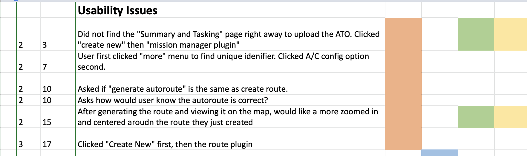
Raw data compared across all users (Rainbow Spreadsheet)