
Hookit Brand Account Dashboard
The Overview
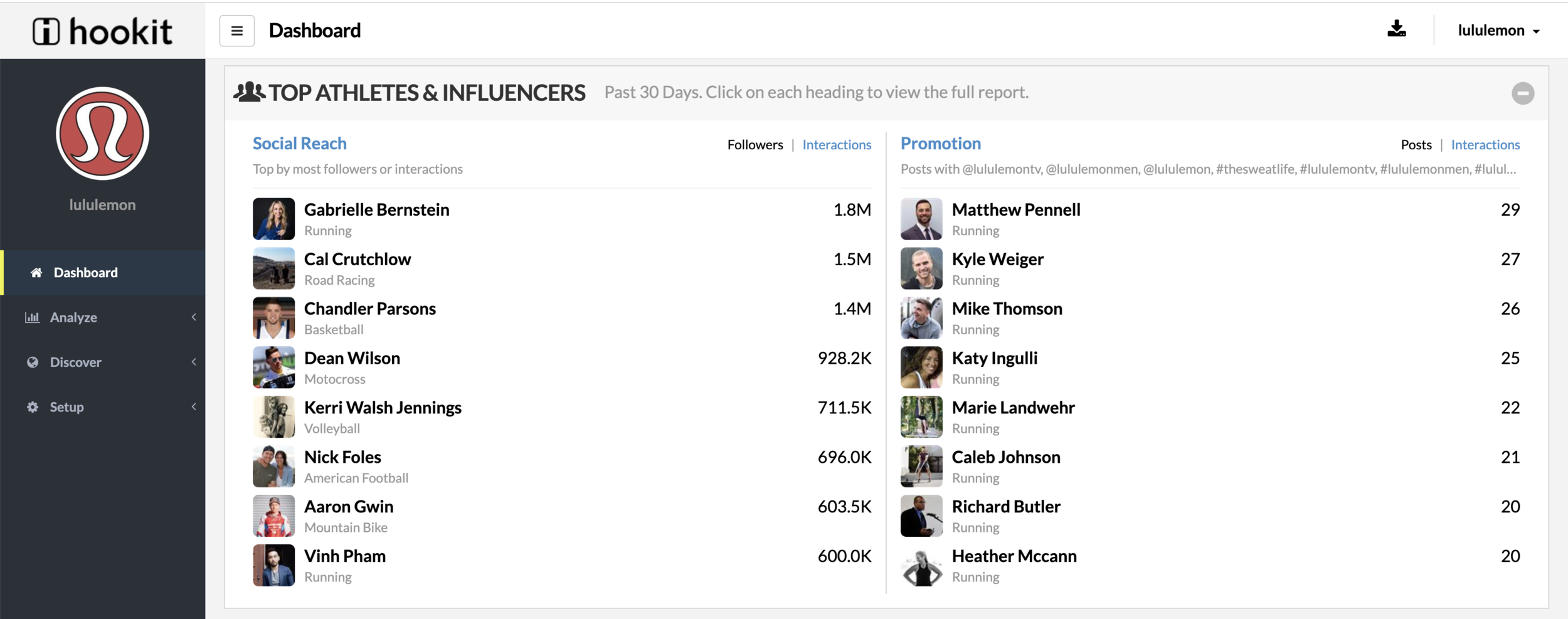
The Brand Account is a tool designed for brands to track social media metrics and ROI on their sponsored and watched partners. The old Brand Account dashboard didn’t tell brands the complete story of how their athletes are doing at a glance. One of the main goals of redesigning the Brand Account was to give brands an overview of their partners’ performance.
The Process
Internal Stakeholder Interviews
I individually spoke to the CEO, CPO, CRO, and client success manager to better understand the business and customer needs. On the business side, there was a resounding agreement to provide deeper actionable insights and a stronger focus on these Hookit metrics: Promotional Effectiveness, Adjusted Ad Value, Max Ad Value, and Promotion Quality.
I wasn’t allowed access to users for this particular feature so I worked closely with the client success team and business analysts to gain insight into user needs. After sifting through the customer requests, I found that the common theme is that users need a dashboard that summarized the brand’s top metrics and athletes' performance on one page. The old dashboard was too focused on event campaigns and it did not give users the “at a glimpse” view.
Hookit’s old dashboard:


Team Sketches
After gaining insight into the business and user needs, I held a Crazy 8’s sketching activity with the CPO, product and engineering team, client success team, and data team. Each team had unique insights into what the users need and how we can meet those needs given the data.

Crazy 8’s rules, context, and prompt.
I asked my colleagues to specifically focus on ways to visualize logo and text promotion and the relationship between Max Ad Value, Promotion Quality, and Adjusted Ad Value.


Prototype and Test Charts
We generated many great ideas during our sketching session. However, I wanted to test out some of the different chart types because I felt like some charts worked better over others depending on the data set. I was particularly curious about the following chart types:
Stacked bar chart vs an unstacked bar chart.
Double y-axis chart vs double x-axis chart.
I quickly made some chart prototypes with real data using Tableau to visualize a brand’s post trends. I uploaded the graphs into two separate Optimal Workshop surveys. One survey tested the stacked bars and duo x-axis chart. The second survey tested the unstacked bars and double y-axis chart.


There happened to be 6 customers visiting the office one day and I was able to snag a few minutes with each customer. I observed and timed the participants individually as they completed each task.
Preview Test Version 1
Preview Test Version 2
Analysis
All of the participants were able to understand the visualization. However, the unstacked chart and duo x-axis performed significantly better; users were more quick with finding the data points in these charts. Going forward, I’ll make sure to find alternatives to stacked bar charts and double y-axis charts.


Ideate
After the test, I felt confident enough to begin wireframing. Because we already have an established design system, it made sense to jump into mid-high fidelity wireframes. With the redesign, I wanted to focus on visualizing the topline metrics and highlighting the Promotional Effectiveness (PE) score since the PE score is a main selling point for Hookit.
The first round of wireframes helped facilitate conversations with the stakeholders. The overall consensus was that the visuals should be more detailed.

For the second iteration, I dedicated visuals for each topline metric. Now the user will be able to click into each tab to view a more detailed breakdown of the metric.
However, I received feedback that clicking into the tabs does not allow for an “at a glance view.”

